Sales Analytics
Designing Sales KPIs That Support Decisions
Why a useful sales dashboard needs more than revenue totals—and how trends, product mix, and contributor performance create context.
A sales dashboard should explain movement, not only display totals
Revenue is usually the first number on a sales dashboard. It matters, but a revenue total alone cannot tell management whether performance is improving, whether growth came from volume or price, which products changed the mix, or whether results depend on a small number of contributors.
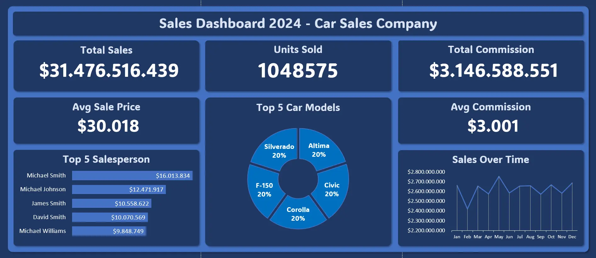
The dataset in this project represents $31.48 billion in sales and 1.05 million units, with May appearing as the peak sales month. Those figures describe scale and timing. The analytical value comes from explaining how they connect.
The central design question is: what does management need to know in order to protect, improve, or reproduce sales performance?
Start with a KPI contract
Before building visuals, every KPI needs a short contract: its definition, calculation, grain, filters, owner, and intended decision.
For example:
- Sales revenue: total recognized sales value within the selected period
- Units sold: quantity of completed units represented in the same transactions
- Average selling value: sales revenue divided by units sold
- Commission: calculated commission associated with included transactions
- Commission rate: commission divided by sales revenue
The precise wording must follow the business process. “Sales” could mean orders created, invoices issued, payments received, or revenue recognized. If teams use different definitions, a dashboard can create more disagreement than clarity.
I would validate transaction identifiers, duplicate rows, cancelled orders, returns, missing dates, currency consistency, and relationships between products, salespeople, and transactions before calculating the headline figures.
Decompose revenue into drivers
Revenue can be expressed simply:
Revenue = units sold × average selling value
This decomposition turns a change in revenue into two investigative paths. If revenue rises:
- Did the organization sell more units?
- Did the average selling value increase?
- Did both change?
- Did the product mix shift toward higher-value items?
The same revenue growth can represent very different business conditions. Volume-led growth may require inventory and operational capacity. Price- or mix-led growth may require checking margins, discounting, and customer retention.
This is why an executive KPI should lead naturally into a diagnostic view rather than stand alone.
Add context with comparisons
A number becomes informative when it has a relevant comparison. Depending on available data, I would include:
- Previous month
- Same month in the previous year
- Budget or target
- Rolling average
- Contribution to total
Each answers a different question. Month-over-month comparison highlights recent movement but can be distorted by seasonality. Year-over-year comparison handles recurring seasonal patterns better, but it may hide a recent turning point. Target variance measures execution against a plan, while contribution shows which segment explains the total.
For the May peak in this dataset, the next questions should be:
- Is May consistently strong or exceptional only in one year?
- Which products account for the difference?
- Did units and average selling value move in the same direction?
- Was performance broad-based or concentrated?
Without these checks, “May is the best month” remains an observation, not an insight.
Separate product performance from product mix
Product analysis should not stop at a ranking by revenue. A product can rank highly because it sells many units, has a high selling value, or appears frequently in a large market.
I would examine:
- Revenue contribution
- Unit contribution
- Average selling value
- Trend over time
- Share of total sales
- Margin contribution, if cost data is available
Mix matters because total performance can improve even when several products decline, provided growth in another category is large enough. Conversely, a strong total may hide weakening demand in strategically important products.
A useful product view therefore shows both the current contribution and the direction of change.
Evaluate salespeople fairly
Salesperson rankings are easy to read and easy to misuse. Raw revenue may reward people with larger territories, established accounts, higher-priced products, or more favorable lead allocation.
A fairer review would consider:
- Revenue and units
- Target attainment
- Growth within the assigned portfolio
- Average selling value or discount behavior
- Customer retention
- Margin, if available
- Territory and product opportunity
The dashboard in this project can identify contribution and ranking, but it should not be treated as a complete employee-performance system. Its role is to surface where performance differs and what context a manager should review.
A ranking tells us who is on top under one calculation. It does not automatically tell us who performed best under comparable conditions.
Build a reading path from outcome to cause
I structured the dashboard in layers:
- Outcome: sales, units, and commission establish scale.
- Movement: the monthly trend shows when performance changed.
- Composition: product analysis shows what contributed.
- Contribution: salesperson analysis shows who contributed.
- Exploration: filters let management test a period, product, or contributor.
This sequence mirrors an executive conversation: what happened, when did it happen, what drove it, and where should we respond?
Visual consistency matters here. Revenue, units, and commission should not use similar-looking charts if their scales imply different meanings. Labels should state units clearly, and abbreviated values such as billions or millions should never require the reader to guess.
Translate findings into actions
A dashboard should suggest a decision playbook:
- Revenue up, units up, selling value stable: confirm inventory and fulfillment capacity.
- Revenue up, units down, selling value up: check whether pricing or product mix drove growth and whether demand is sustainable.
- Revenue down, units stable: review discounts, mix, and price realization.
- One product drives most growth: protect supply while evaluating concentration risk.
- One salesperson drives most growth: identify transferable practices and account concentration.
- Commission rises faster than revenue: review commission rules and product mix.
These are starting hypotheses, not automatic conclusions. Each should lead to a more focused query or operational conversation.
Limitations that affect interpretation
This dataset does not necessarily contain targets, cost of goods sold, returns, customer acquisition cost, territory potential, or complete customer history. Without cost data, high sales cannot be interpreted as high profit. Without targets, rankings describe contribution rather than attainment. Without customer-level history, the dashboard cannot distinguish repeat growth from one-time purchases.
Other concerns include:
- Currency or tax treatment may differ across transactions.
- Returns and cancellations may lag the original sale.
- A peak month may reflect reporting cutoffs.
- Commission can be calculated at a different stage from revenue.
- Product and salesperson names may change over time.
A data dictionary and refresh log should accompany the dashboard so users know exactly what each measure includes.
A stronger next version
The next iteration should add gross margin, target variance, customer segment, repeat-purchase behavior, returns, discounts, and regional opportunity. A simple contribution analysis could then explain how much of a period change came from volume, selling value, and mix.
Alerts can also be useful, but only after definitions are stable. For example, management might review a product when revenue falls below its rolling baseline while inventory remains high. The alert is valuable because it connects a measured condition to a specific operational response.
Final takeaway
Good sales KPI design does not maximize the number of cards on a dashboard. It creates a chain of evidence:
outcome → comparison → driver → context → action
Revenue establishes the result. Units and selling value explain its mechanics. Time, product mix, and contributor analysis provide context. Clear definitions and limitations keep the story credible.
That is the difference between reporting sales and supporting a sales decision.